
Google Calendar
rethinking Google Calendar as a more integrated planning tool
feature enhancement / productivity / integration
mobile app and desktop web
The lack of meaningful integration between Google Calendar and Tasks forces users to manage planning across multiple apps, despite Google already providing many of the features that make third-party tools appealing. By analyzing both mobile and desktop platforms, I identified cross-platform gaps and opportunities to leverage Google’s existing infrastructure strengthening its role as a, comprehensive productivity ecosystem.
Duration
2 Weeks
Role
User Research, UX Audit
Tools
Figma, Miro, Photoshop, Illustrator
opportunity
to help users plan their events alongside their tasks in one place without feeling overwhelmed by their schedule
Problem
Although widely used, Google Calendar’s disconnected events and tasks experience results in fragmented workflows, reliance on third-party tools, and increased mental fatigue for users.
Solution
This project aims to unify tasks, events, and reminders into a single, seamless Google Calendar experience to improve usability, reduce app-switching, and support more flexible day-to-day planning.
Outcome
A redesign results in a more seamless, active planning experience designed to increase user retention within the Google ecosystem and reduce drop-off and context-switching friction.
AT A GLANCE


RESEARCH
70% of adults rely on digital calendars, but only 35% use task-planning software.
Competitive Market Analysis
to analyze leading planning apps on how they integrate tasks, calendars, and daily planning features

Todoist
smart task recognition
multiple views
simple interface

Microsoft To Do
task prioritization for the day
unified tasks, notes and reminders
integrated with Outlook

Structured
visual customization
events and tasks in a single timeline
inbox task capture

TickTick
task categorization (Eisenhower matrix)
task completion timer (Pomodoro)
syncs with other calendars
“I want to see my tasks and events in one place, and flip between whichever feels primary.”
“I want my calendar and to-do list to feel connected but still clearly distinct.”
Target Users
- Use Google Calendar but rely on other apps or paper planners for tasks and reminders;
- Rely on both mobile and desktop devices for planning and organization;
- Need clear visibility across professional and personal calendars and lists.
“I want a checklist alongside my meetings to tackle any time, without fixed time slots.”
Method
In-depth interviews with users to gather insights on their current planning habits, tool usage, pain points, and preferences for managing meetings, tasks, and personal responsibilities.
Key Insights
Focus and Deep Work Support
Users favor focus time, recurring blocks, deep work scheduling, and isolating tasks from events.
Collaboration & Shared Visibility
Users need shared calendars and task lists with co-editing and real-time updates.
Flexible Task Management
Users want a schedule that can roll over, be reprioritized, and adapt dynamically to changing schedules.
Visual Clarity & Accomplishment
Users want color-coding, tags, prioritization, flexible views and completed tasks checked off.
Integrated Tasks & Events
Users want tasks, deadlines, reminders, and events in a single timeline while differentiating between the two.
Cross-Device & Offline Access
Users expect seamless use across mobile and desktop with offline functionality and automatic syncing.
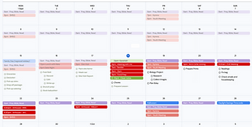
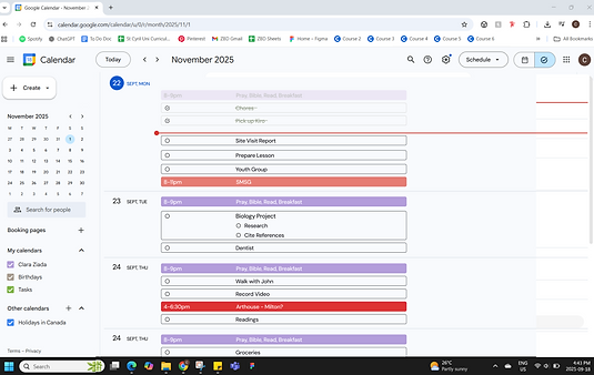
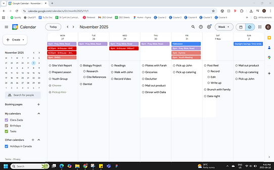
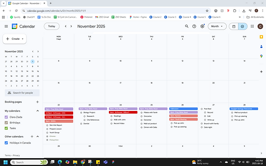
AUDIT
I conducted a comprehensive audit of the existing Google Calendar mobile app and desktop website to identify usability issues and opportunities.
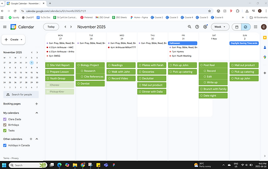
Desktop
Task Limitations
- Tasks are separate from the calendar, limiting date-based planning and integration.
- Incomplete and repeating tasks are hard to manage, requiring navigation to a separate page.
- Tasks only marked complete by opening them.
- Tasks have limited viewing style options.
- Additional features like color-coding, tagging, formatting, and prioritization are missing.
Calendar Limitations
- Calendar tasks must be created individually.
- Collaborators cannot be added during creation.
- Calendar sharing and subscription lack flexibility, like viewing specific events or times.
- Cross-platform syncing is limited, forcing users to rely on third-party tools.
- Users want seamless two-way sync with non-Google calendars.

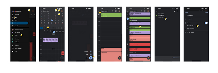
Mobile App
- Cannot switch to the Tasks tab to view tasks alone.
- Clicking a task opens it for editing. There is no one-step way to mark it complete.
- Cannot add people, color-code or prioritize tasks.
- Drag-and-drop would be useful.
- Tasks only viewed on a more focused calendar timeline view (e.g., 3-day, schedule, or day).
- The “+” button changes behavior after clicking.
- Dual calendar view (expanded monthly + weekly) works well and could better integrate the lists.
DESIGN PROCESS & ITERATION
How might we...differentiate calendar events from tasks while viewed together, provide multiple views to suit users’ planning styles, and support visual tools while maintaining a clean, Google-forward interface?
Mobile App
Calendar Focus, Weekly View
A toggle was added to let users switch between calendar and task views, aligning with the desktop experience.
Tasks follow Google’s visual language by appearing at the top in green boxes, with events displayed below.
Task Focus, Weekly View
Events appear at the top (looking similar to the desktop monthly calendar) with tasks listed below.
Two design iterations were explored: one preserving Google’s green task boundaries, and another inspired by paper note-taking for a more tactile, list-based experience.


Task Focus, Daily View
This daily view builds on the existing layout but shifts the focus toward tasks and a hybrid structure: events are displayed above, tasks below, and an expandable month label.
Two variations were explored: one prioritizing visual consistency across views, and another highlighting task drag-and-drop affordances.


Task Status
Before:
All tasks displayed with a circular check icon regardless of completion status + Pending tasks collapsed showing only their count.
After:
Task icons changed to a plain circle that becomes checked upon completion + Pending tasks received a distinct icon to clearly differentiate carried-over tasks from new or completed ones.


Desktop Model
Task Focus, Weekly View
Version 1
Schedule View
Task Focus, Weekly View
Version 2
Monthly View
User Feedback
General Wants
- Distinction between timed tasks, general daily tasks, timed events, and all-day events.
- Ability to add longer to-do lists, instead of adding one task at a time.
Mobile App
- Mixed results around the new toggle between the calendar and task tabs that mimicked the desktop.
- Users appreciated the mixed visual layouts and sought a more task-focused layout for mobile.
Desktop Website
- Users liked having a dedicated tasks page where tasks feel primary and events secondary.
- Users requested the ability to create multiple tasks at once directly from the calendar view.
SOLUTION
Mobile App Model
Weekly View (with task carryover)

Weekly View (with scheduled tasks)

Daily View (with task edit)

Adding Tasks

(can add multiple and label each)

New List View


List View (with expanded calendar)

Schedule View

Desktop Web Model

Events and timed tasks in calendar below and unscheduled tasks as a list above.

Events are at the top and to-do list at the bottom

Events and timed tasks in a boundary box to the left and unscheduled tasks as a list to the right.
Events and timed tasks in calendar below and unscheduled tasks as a list above.
REFLECTION
What I Learned
Accommodate different planning styles and preserve the simplicity and clarity of paper/analog planning in the digital platform.
Support flexible task management, allowing users to add details only when needed while keeping the interface simple and intuitive.
What I Would Do Differently
Create a more efficient drafting and iteration process, even when skipping lo-fi wireframes to focus on visual changes directly in the app.
Test features like subtasks, notes, color coding to ensure they remain unobtrusive for users who prefer simplicity.
Next Steps
Implement toggles to show/hide tasks associated with specific calendars.
Creating a dynamic time management tool for backward planning (eg adding tasks with a deadline, estimated time needed, and prioritization level).